SAWS
Brand Concept
Packaging Design

Brand Concept
Packaging Design
For this project, we initiated from the ground up, meticulously
developing the brand name and the overarching branding concept for
SAWS.
Our aim is to craft a coffee shop experience
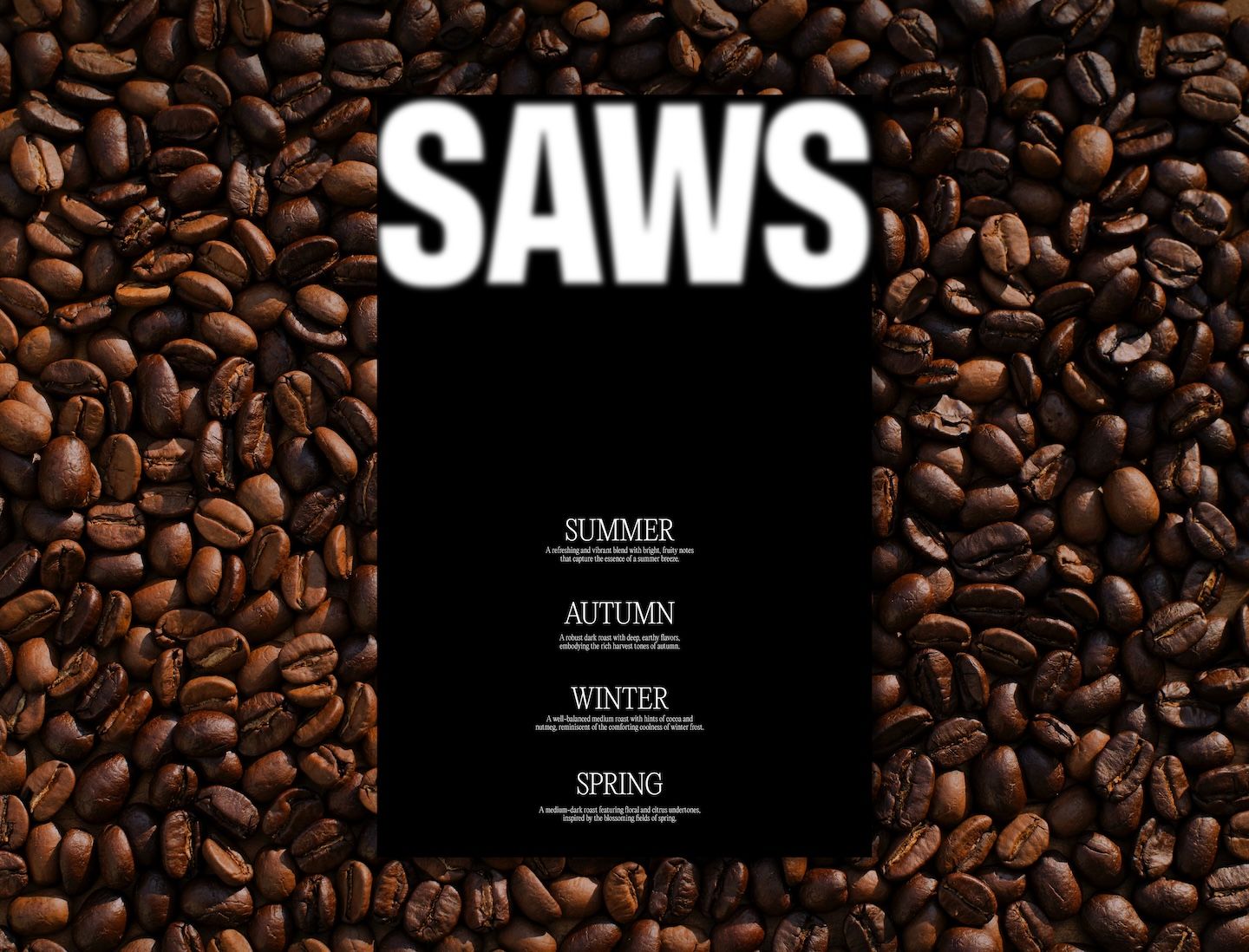
unlike any other. The signature beans, named after each
season—Summer Breeze Light Roast, Winter Frost Medium Roast,
Blooming Fields Medium-Dark Roast, and Harvest Haven Dark Roast—are
thoughtfully curated to infuse life and emotion into every bean.
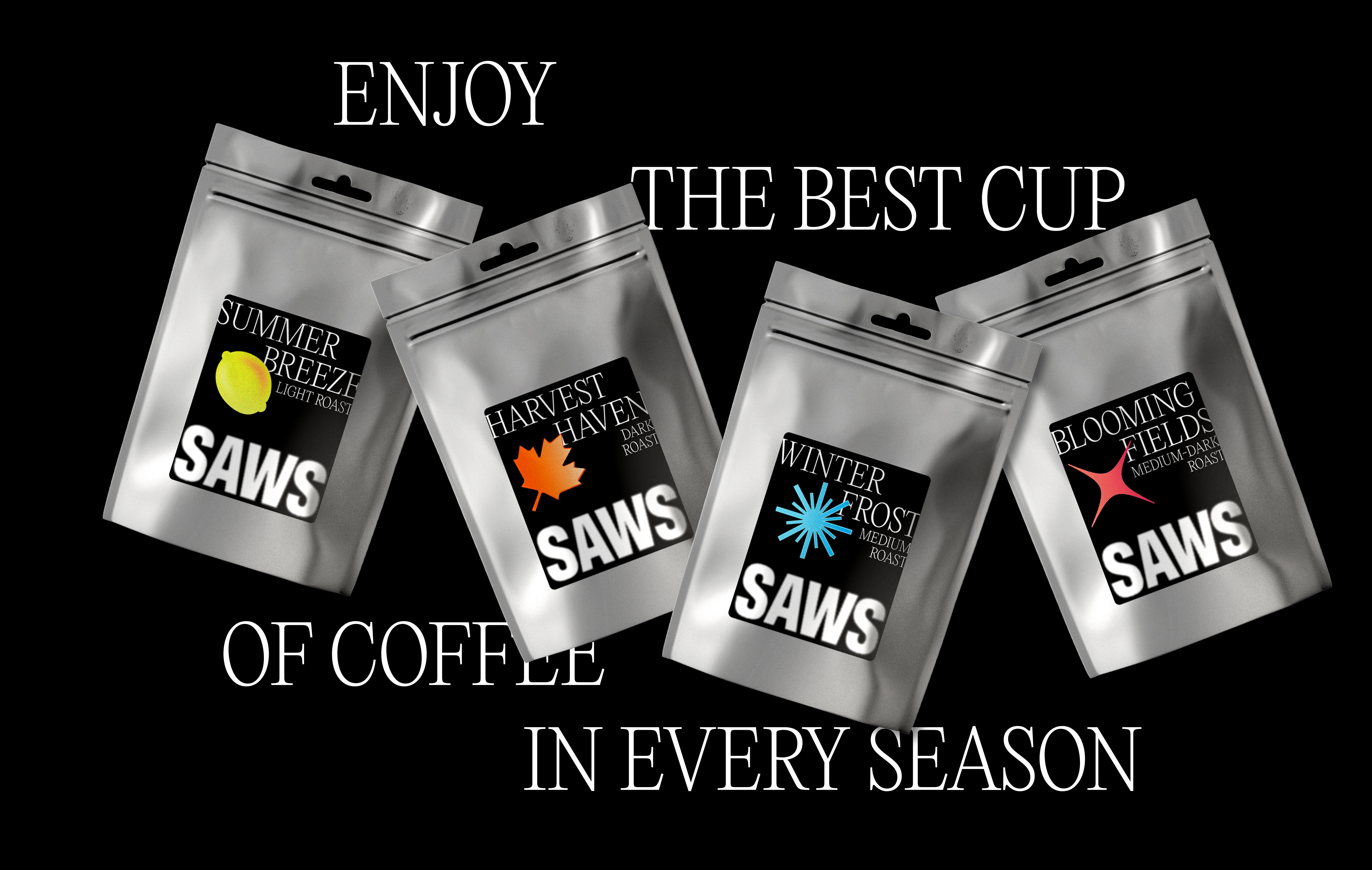
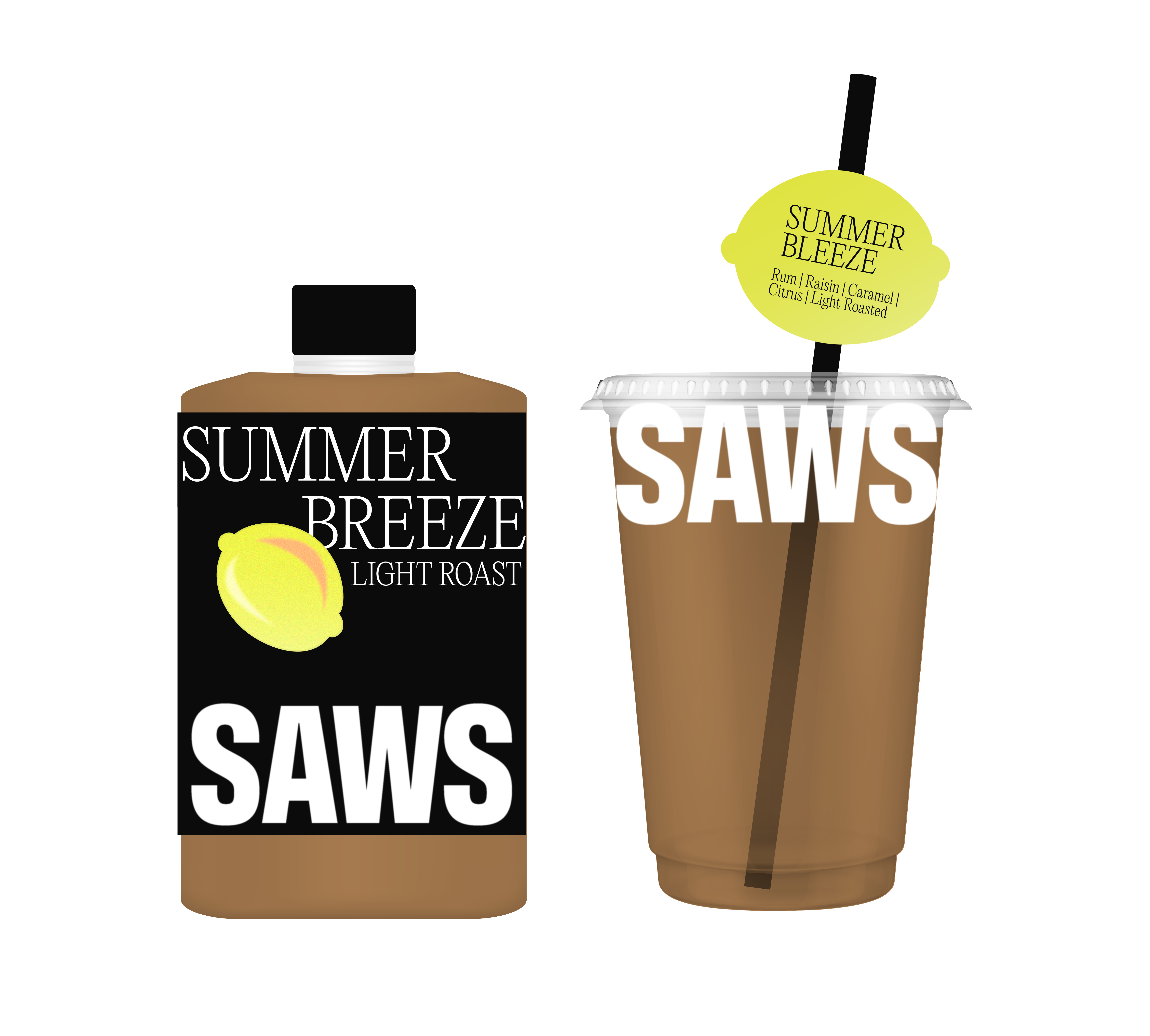
Visually, we embraced a sophisticated black color palette and trendy
typography, reflecting a contemporary and cool aesthetic. Infusing
vibrancy, we integrated season-specific elements: a lemon for
summer, a Maple leaf for autumn, a snowflake for winter, and a
blooming star for spring.
Our objective extends beyond
offering a mere cup of coffee; we've designed an immersive journey
through the seasons, crafting a distinct and memorable brand image
for SAWS.
